Data science 101: don't be "that guy"
My career accelerated when I started caring manically about numbers and measurements. And I bet yours would, too.
I used to work with an engineer who would run many A/B experiments evaluating two CDN providers, and quite literally come up with results such as
Latency p50 when sending images has improved by 7ms (-6%)
“Look what a win!” Not so fast! What was wrong with the “win” above:
-
Distribution cherry-picking: p50 improvement rocks. How is p90, p99? Those are the users that are struggling.
-
Metrics cherry-picking: What happens when sending videos. Videos are orders of magnitude bigger. If images improve by 6% but regress videos by 1%, it’s a net loss.
-
Impact. Sending an image takes hundreds of milliseconds, and 7ms is imperceptible to humans. Sure it’s desirable, but are we really moving the needle.
-
Completeness: what else changed? Cost? Contractual obligations?
-
The viewer! One user sends an image, but 100 viewers are going to watch it. How is the latency and cost on the viewer end, with 100x impact?
See the problem: As a reviewer I’m supposed to bless these results. But the improvement is small and I can’t really tell if it’s a net positive.
Let’s fix this: let’s change the process! From now on, engineers always need to report p50, p90 and p99. Hooray! Now we’ll get this:
Latency p50 improved by 7ms (-6%), p90 by 4ms (-1%), p99 increased by 1ms (+0.05%)
This is definitely more informative. But I still can’t picture it. How has the user experience changed, really? Let’s compare this to a histogram of latencies.
See this real-life recent example:
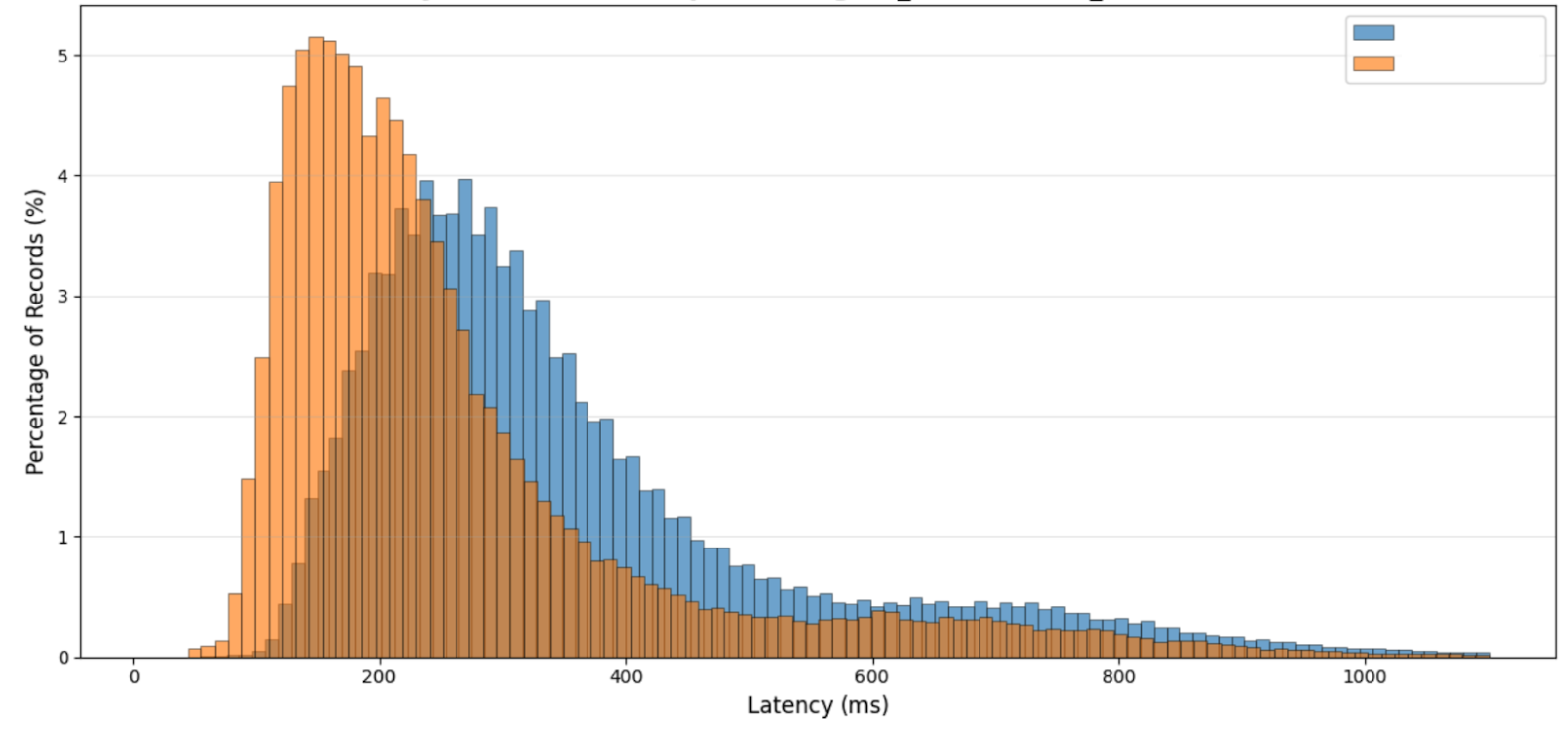
Now I understand. Everyone in the orange population is better. Some much better, and some almost the same.
We could have had the following. The orange population starts better, and the peak (the mode) is better, but then many users are worse off!
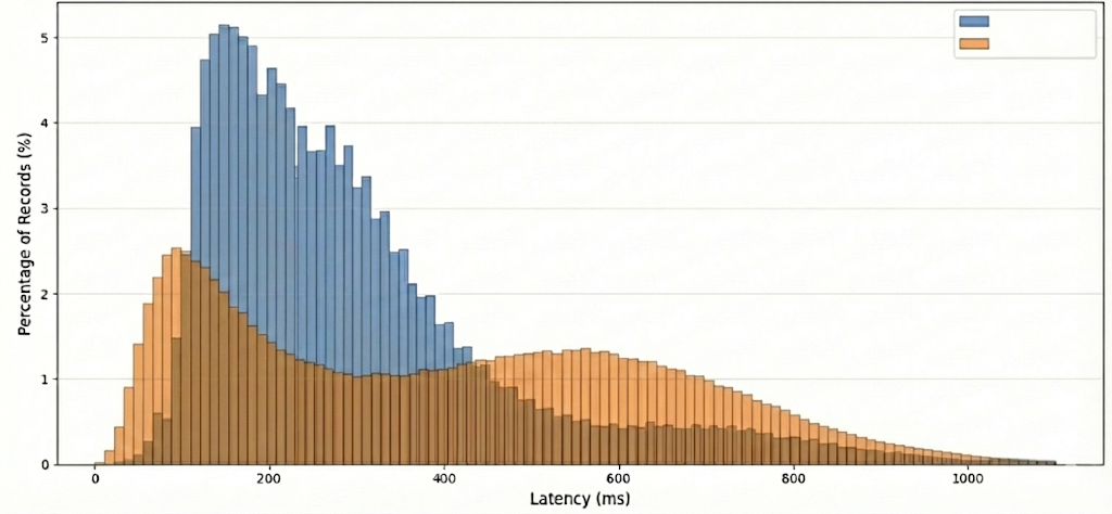
If you’ve read so far and feel more confident about these latencies… wrong again! All we said is true, but the key is that the orange distribution is bi-modal! Why would it have two peaks? Why didn’t the blue one? Answering this is harder than writing SQL or asking the LLM.
Here’s a possible explanation. Say our service is popular in the US and the EU. The Blue latency is from a provider with great service in both continents. The orange latency is from another provider which only has presence in the US. As a result, users in the US perform better, but users in the EU are worse off, creating this shape. It all checks out. We’ve learnt.
Now we can make informed decisions. Do we use different providers for each region? Do we prioritize US QoS over EU QoS, or do we prefer to keep the experience more balanced?
How much deeper we’ve gone just looking at the latency with care. And we haven’t even started with the rest of the problems outlined.
Employee performance review time!
Improving latency will get you a “Meets expectations”. Doing good analysis and getting valuable new insights will get you an “Exceeds expectations”. Turning this into a operationalized strategy where we serve different regions using different providers to the benefit of all will get you promoted.